

1. Define the brand strategy, positioning, and creative brief through research and client insight
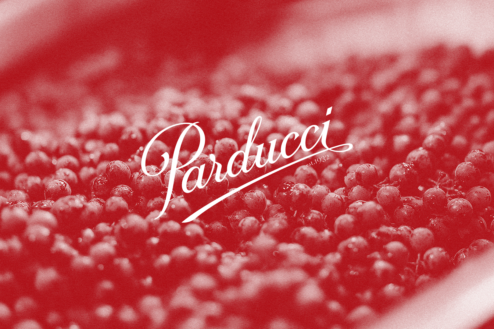
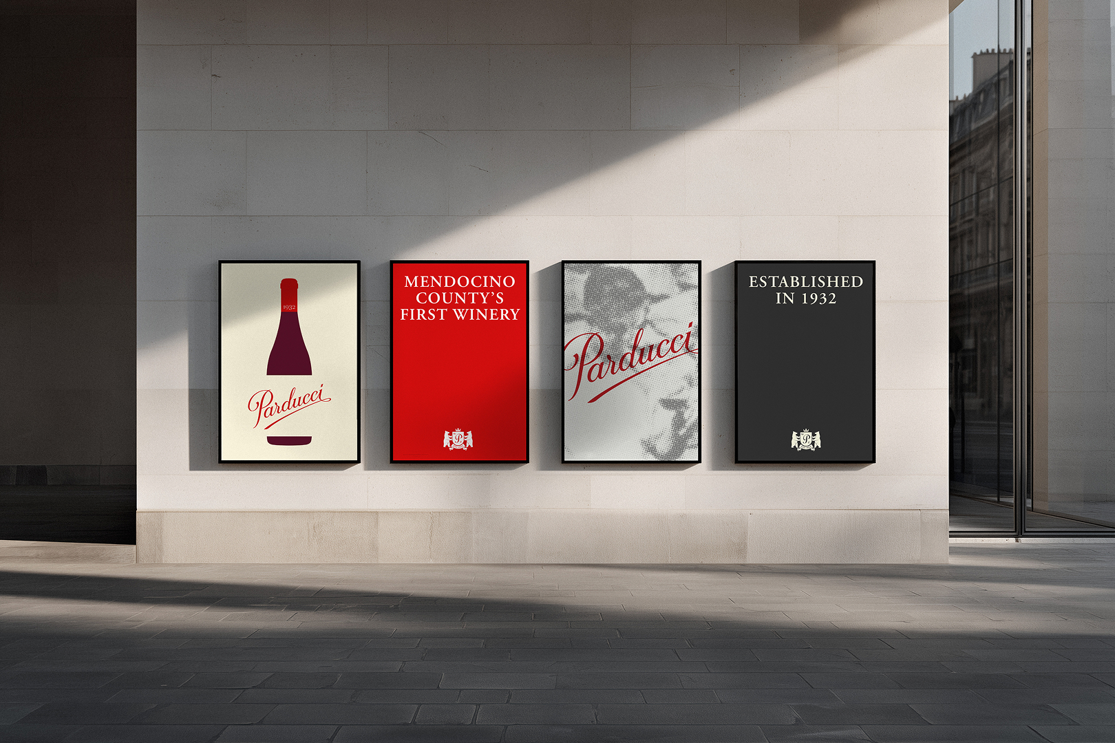
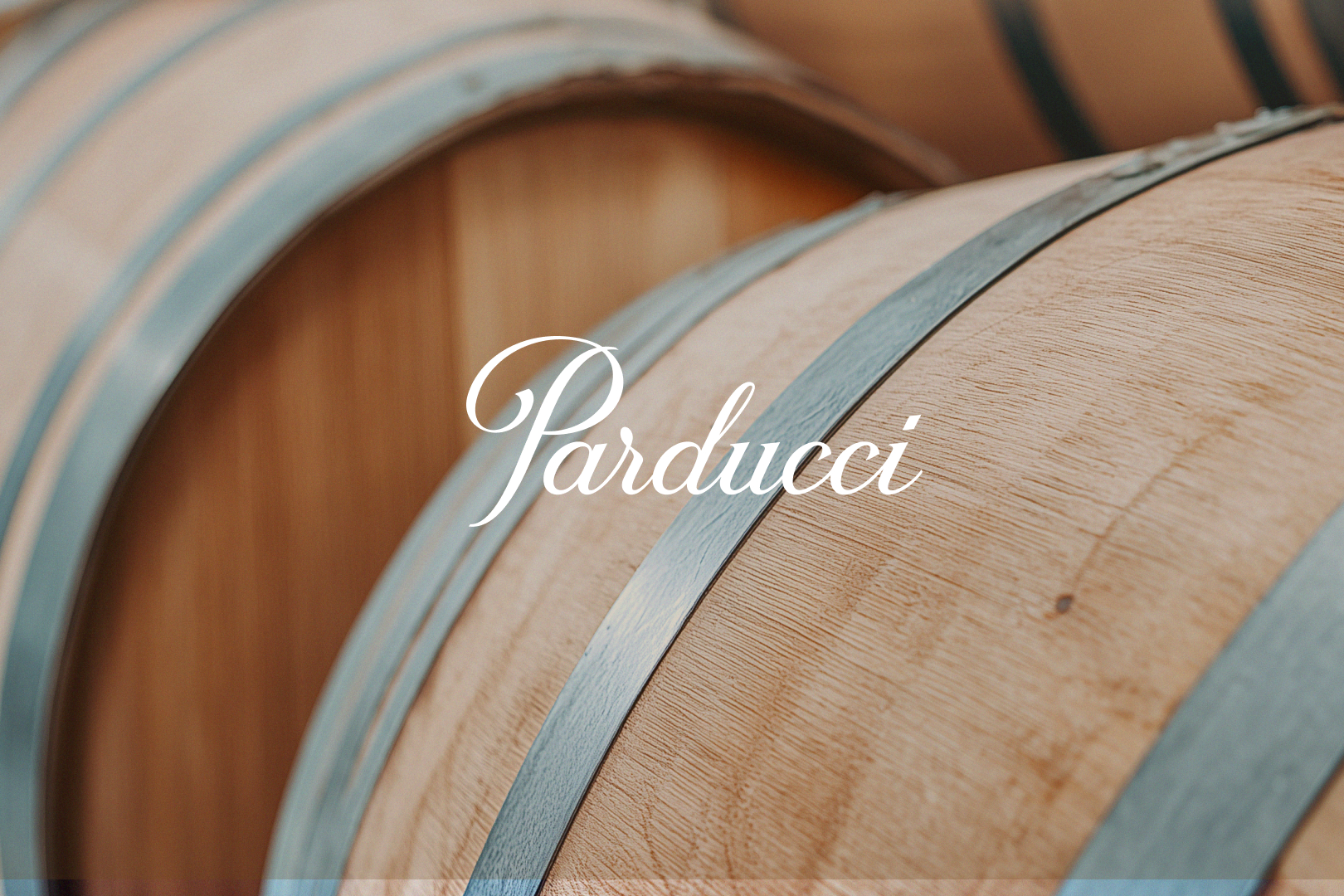
2. Develop visual concepts that unite Italian winemaking heritage with modern design principles
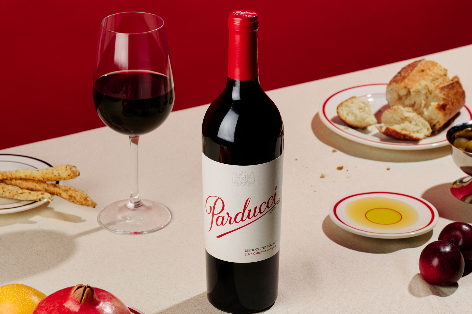
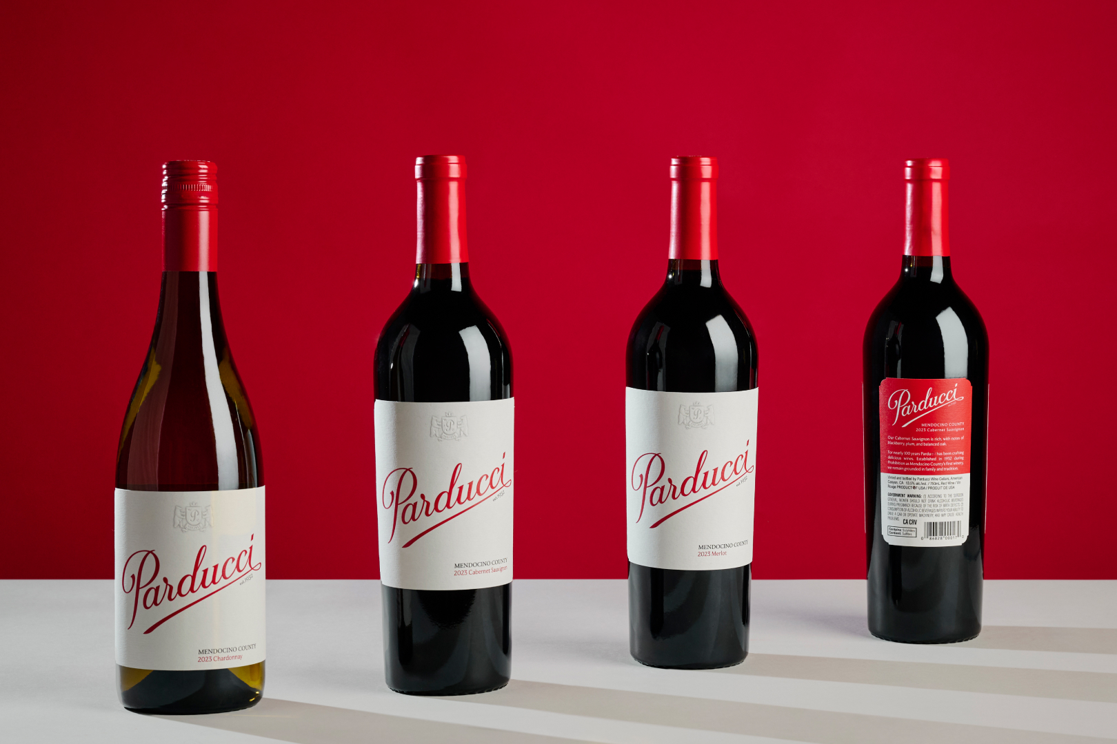
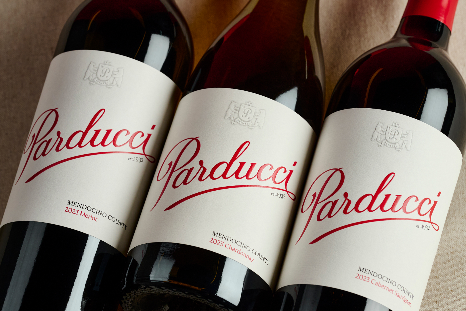
3. Design a flexible label system across varietals and bottle structures
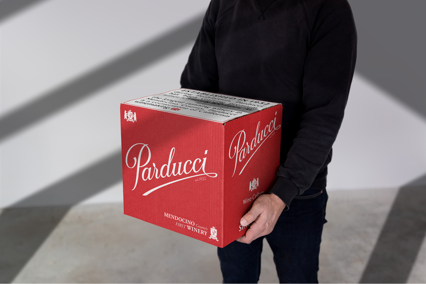
4. Execute the full packaging system, including front and back labels, corks, inserts, and sales materials
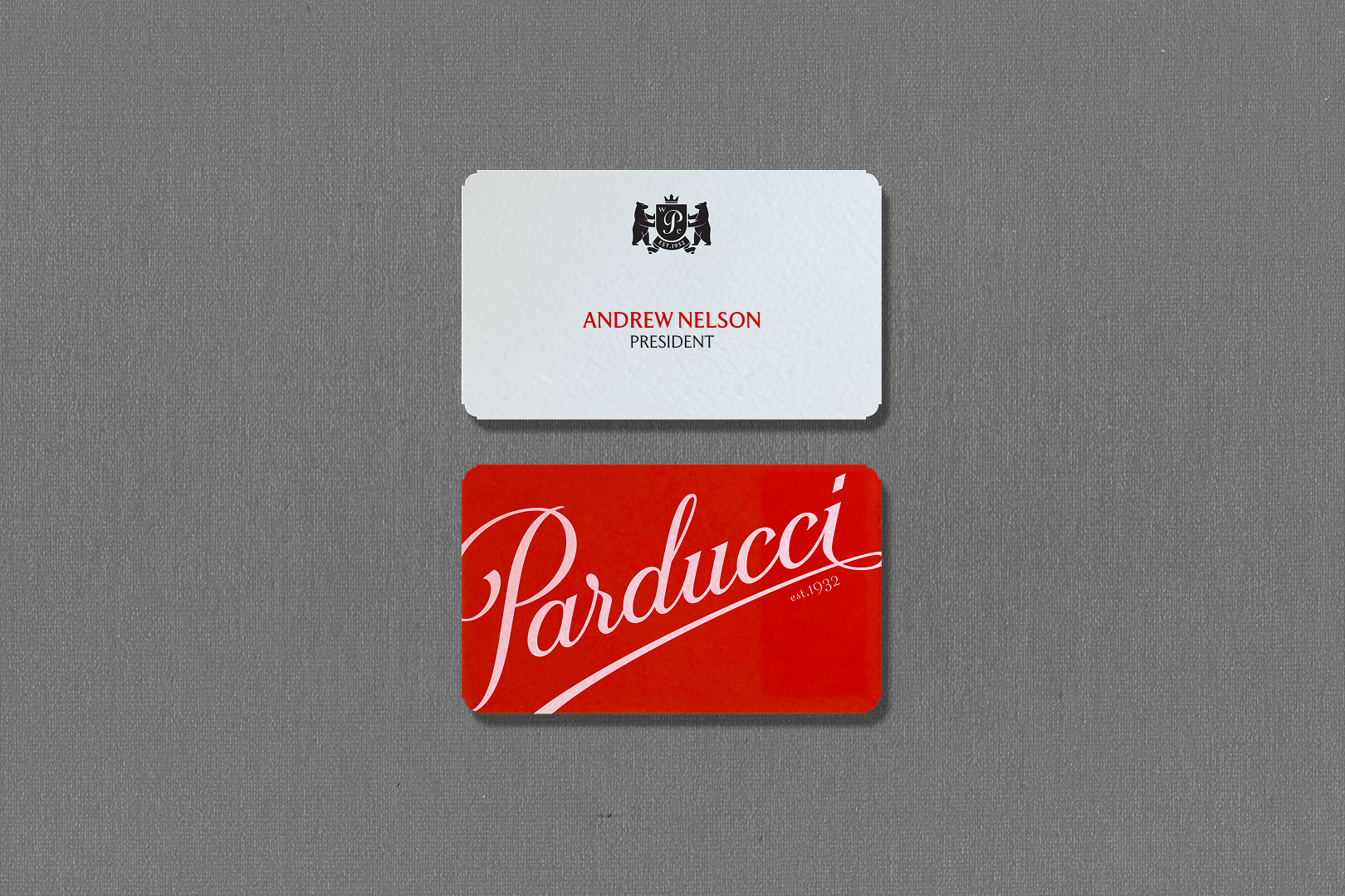
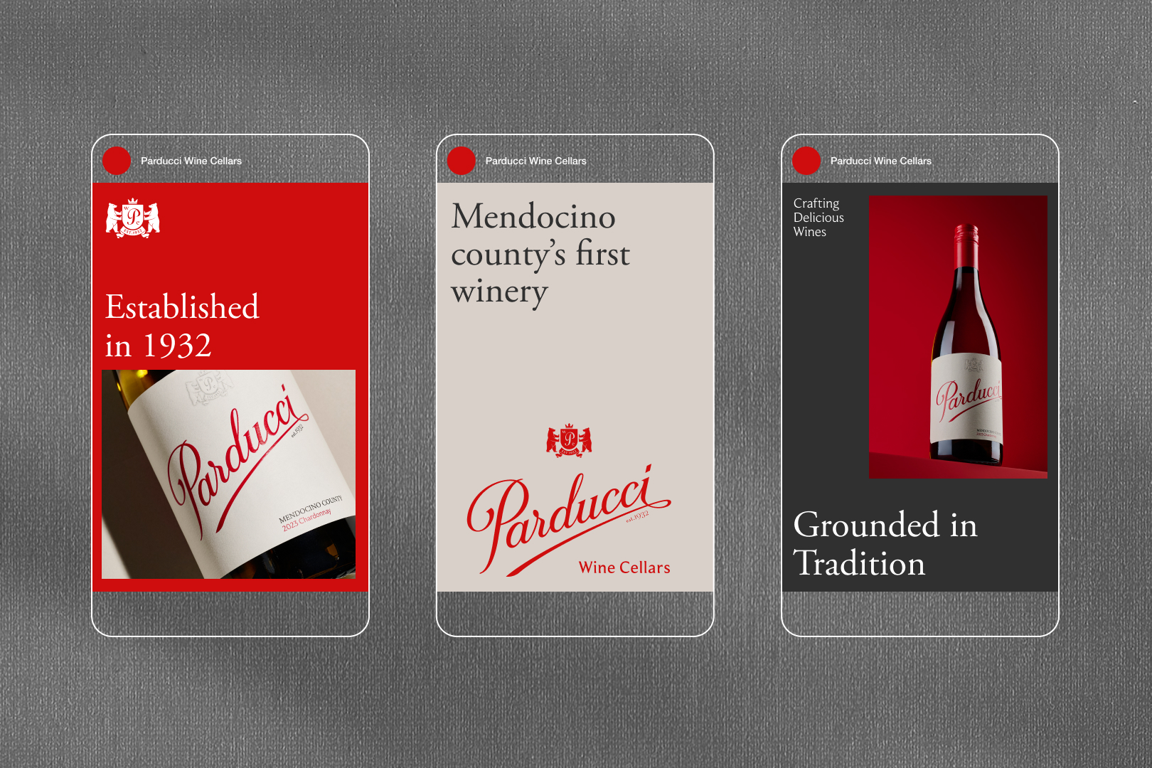
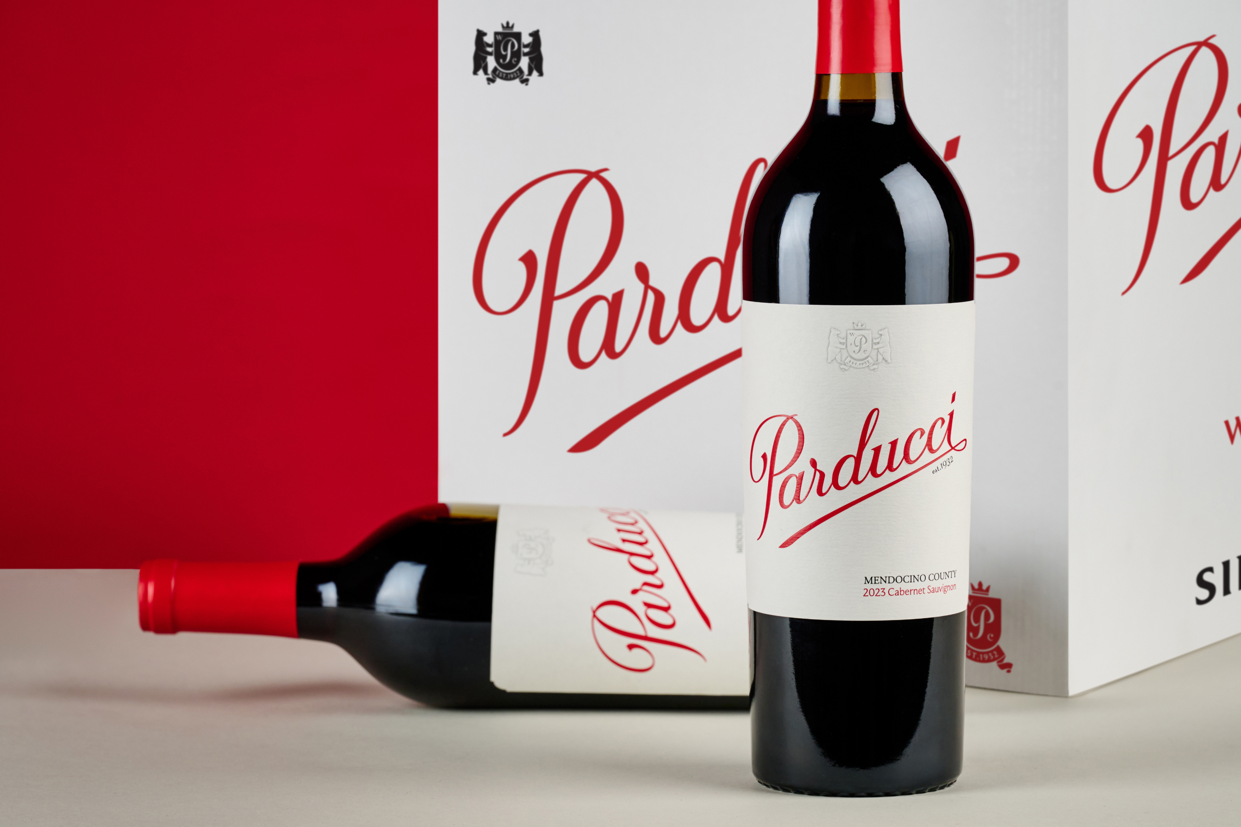
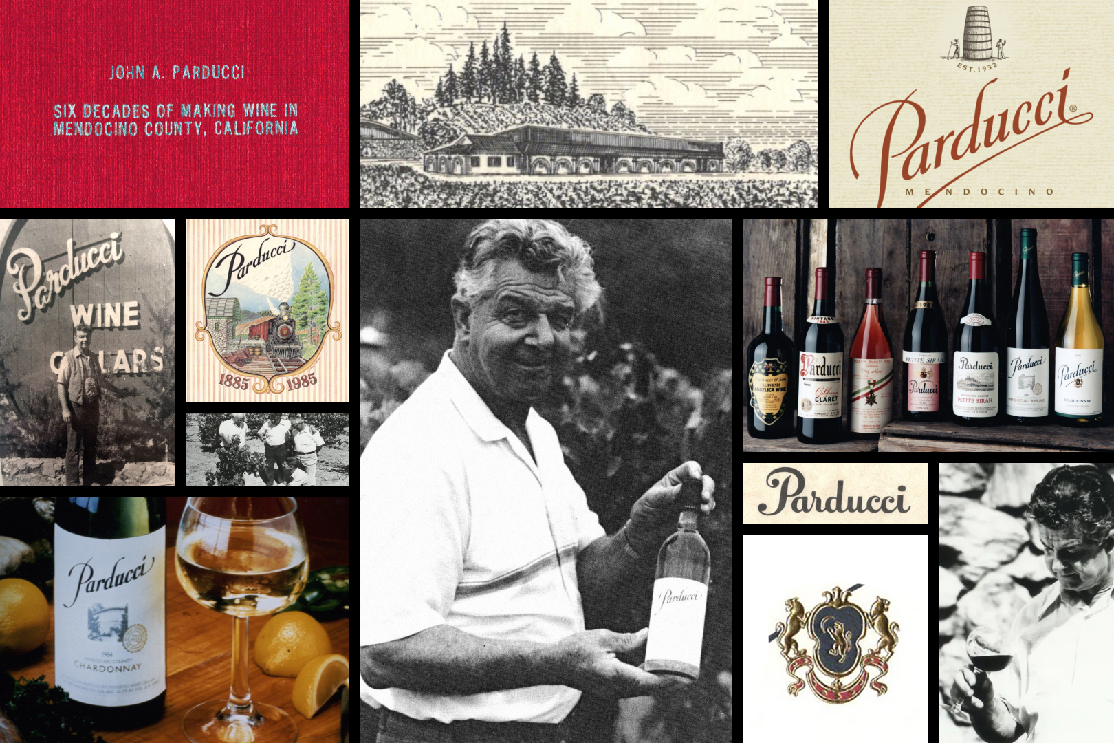
Parducci has always stood for character, craftsmanship, and resilience. Our task wasn’t to reinvent that—it was to refine it. The new system is pared-back and purposeful, honoring the past while confidently stepping into what’s next for California wine.
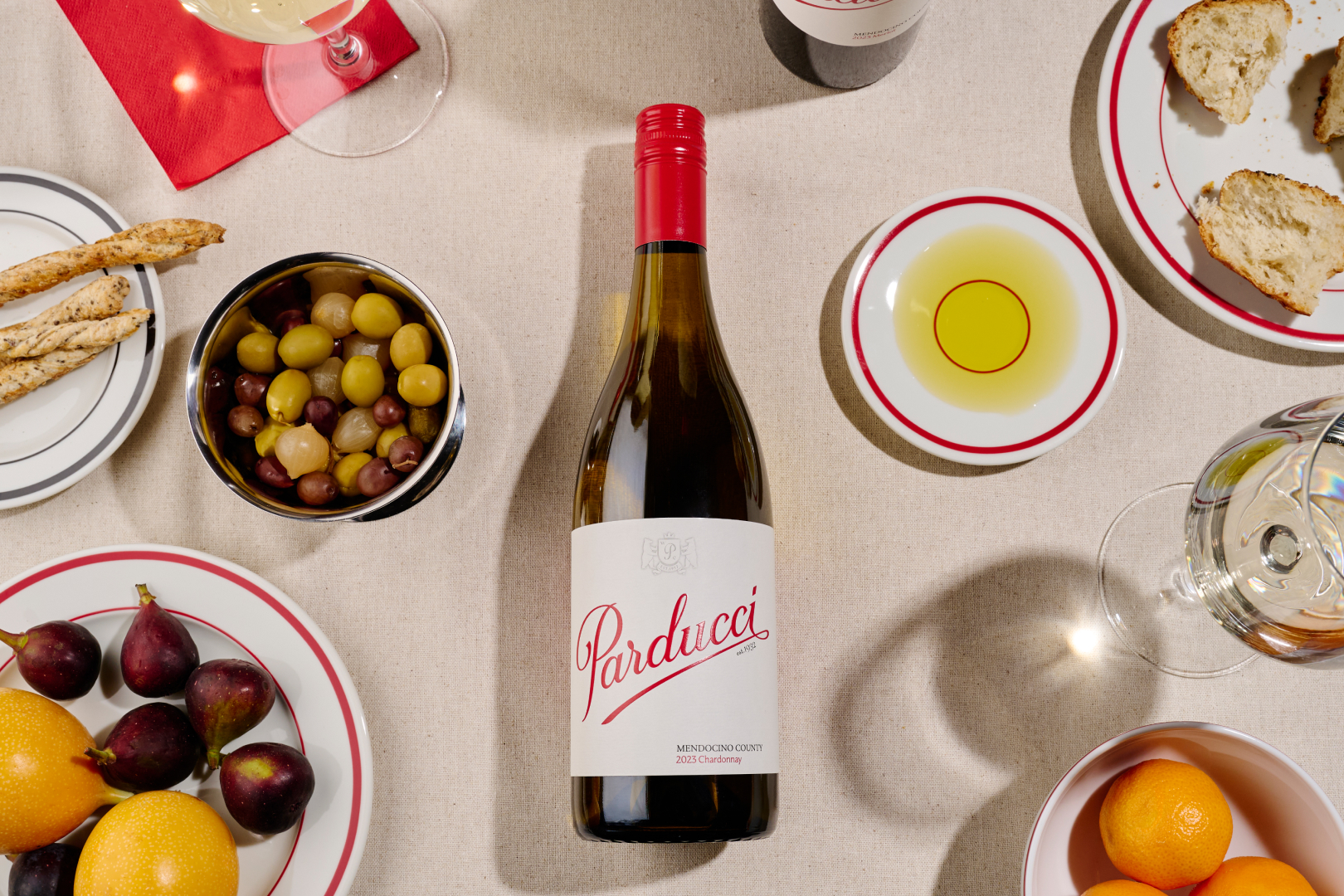
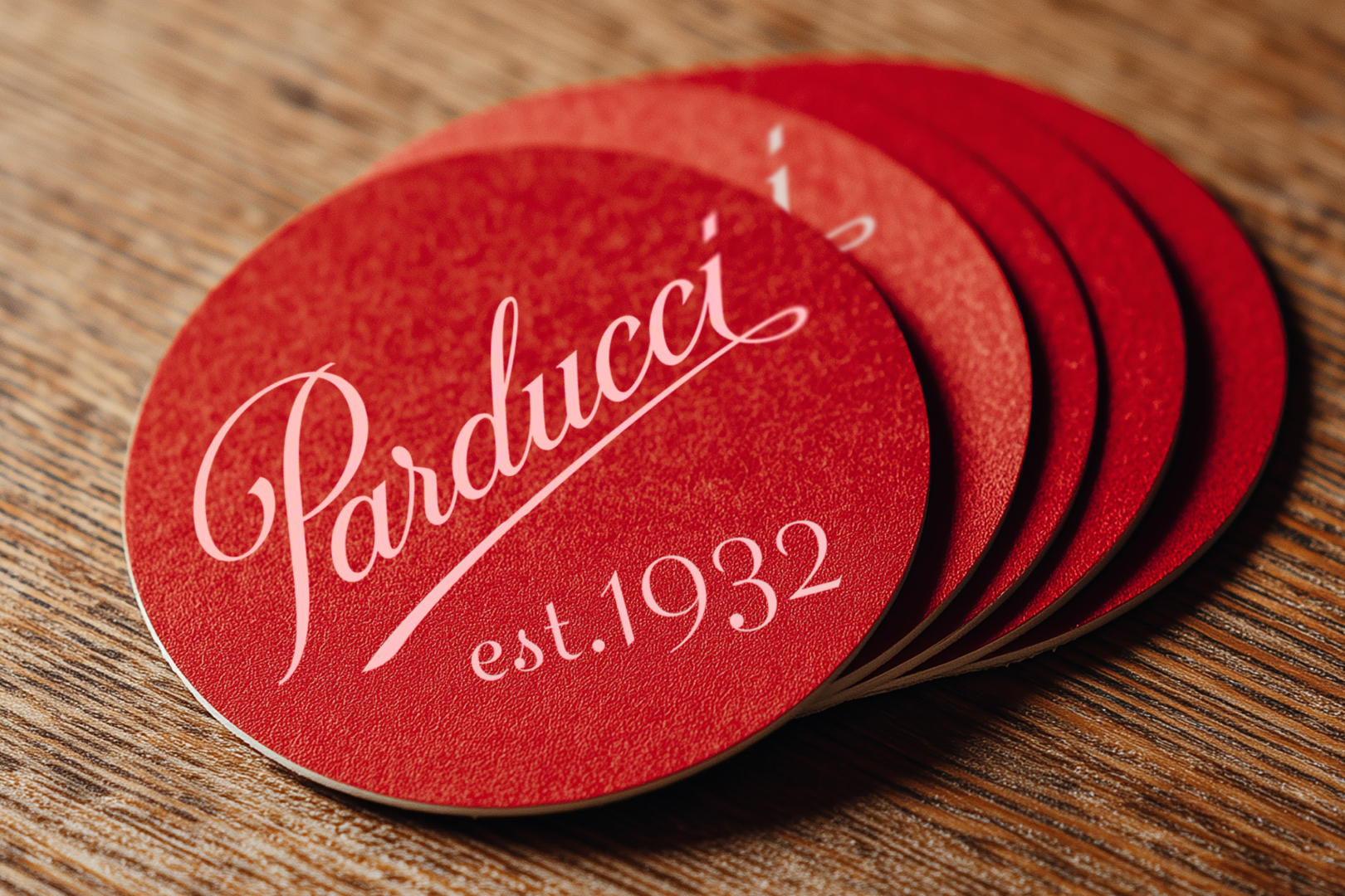
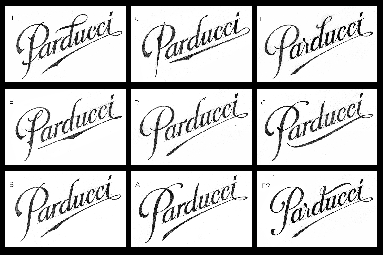
Calligraphy: Martin Schmetzer | Photography: Liliana Barraza | Photo Styling & Direction: Monograf